What Makes a Good Hero Section in the Age of AI
Building great hero sections in 2026 isn't about coding skills. It's about knowing the right vocabulary. Learn the effects that matter and how to describe them to AI tools.
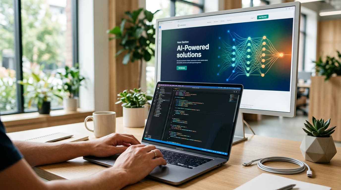
What Makes a Good Hero Section in the Age of AI?
Learn more about retro demo scene graphics: art meets code mastery
The skill that matters most for building hero sections in 2026 is not coding animations from scratch. It is knowing what to ask for.
Two years ago, creating a landing page with parallax effects, scroll-driven animations, and depth-of-field blur meant assembling a team: a designer, a frontend developer, and possibly a motion specialist. The timeline? Two weeks minimum. Now you need the right vocabulary and an AI model that understands spatial design.
This shift represents a fundamental change in frontend development. Design literacy moved from "can you build it?" to "can you describe it?" The developers who thrive are not necessarily those who memorize CSS keyframes or GSAP timelines. They are the ones who can articulate visual intent with precision.
How Does the New Frontend Workflow Prioritize Description Over Implementation?
Building a production-grade hero section now follows a different pattern. You describe the effect, name the technique, and let AI handle the implementation.
Drop "parallax hero with a PullWords text reveal and depth-of-field blur" into the right AI tool, and you get what used to require days of custom development. The barrier dropped from "years of frontend experience" to "a good eye and the right vocabulary."
Two approaches changed how modern developers build hero sections. First, granular design directives that define brand personality, motion principles, and visual hierarchy. Second, AI-powered builders that translate those directives into production code with actual typographic hierarchy, intentional spacing, and purposeful motion.
The Video Effect Vibe landing page demonstrates this workflow. Dark theme, gold accent typography, floating dashboard mockup with immersive scroll animations. All generated through descriptive design language paired with AI execution.
Why Does Gemini 3.1 Pro Outperform Other Models for Frontend Code?
Not all AI models handle visual code generation equally. Gemini 3.1 Pro consistently outperforms alternatives for frontend components because it understands spatial relationships between elements.
When you specify "breathable layout," it produces generous whitespace. Request "immersive" sections, and it triggers full-viewport containers with scroll-based reveals. Other models give you functional code. Gemini 3.1 Pro gives you code that looks like someone with design taste wrote it.
The difference shows up in subtle details:
- Proper visual hierarchy without explicit spacing values
- Natural motion curves instead of linear transitions
- Color palettes that feel intentional, not algorithmic
- Layout decisions that respect content flow
This is not about the model being "better" at code syntax. It is about understanding design intent at a deeper level.
What Essential Vocabulary Should Every Developer Know?
Motion and Entrance Effects
These terms control how elements first appear on screen.
Fade in transitions elements from transparent to opaque. Simple but effective for establishing hierarchy.
Slide up brings content from below the viewport. Common in hero sections to create a sense of emergence.
For a deep dive on intercom's fin apex 1.0 beats gpt-5.4 in customer service ai, see our full guide
Stagger animates multiple elements in sequence with delays between each. Makes lists and grids feel alive instead of static.
PullWords splits text into individual words that fly in one by one. High-impact for headlines.
For a deep dive on welcome to the weird world of ai agent teams, see our full guide
Pop in uses spring physics to overshoot target size then bounce back. Adds personality to button states.
Scroll-Driven Interactions
These effects respond to user scroll position.
Parallax moves background layers slower than foreground, creating depth perception. The foundation of immersive hero sections.
Scroll reveal fades or slides sections into view as users scroll down. Guides attention through content hierarchy.
Scrollytelling unfolds narrative content progressively. Used heavily in editorial and product storytelling.
Sticky hero pins the hero section while inner content scrolls over it. Creates dramatic layering effects.
Zoom on scroll scales images or sections as users scroll. Adds cinematic quality to product showcases.
Focus and Depth Techniques
Gaussian blur creates soft background blur, often behind modals or overlays. Essential for layered interfaces.
Depth of field keeps foreground sharp while blurring background, mimicking camera lens behavior. Directs user attention powerfully.
Blur-to-sharp transition starts content blurred and sharpens on scroll or hover. Creates focus hierarchy dynamically.
Glassmorphism produces frosted glass effects with blur and transparency. Still relevant for modern interfaces when used sparingly.
How Do You Describe What You Want: Practical Examples
The key to AI-assisted frontend development is specificity. Vague requests produce generic results. Precise descriptions produce distinctive designs.
Instead of: "Make it look modern" Say: "Dark luxury aesthetic with gold accent typography, generous whitespace, and serif headlines. Full-viewport hero with parallax background and blur-to-sharp text reveal on scroll."
Instead of: "Add some animation" Say: "Stagger animation for feature cards with 100ms delay between each. Pop in effect using spring physics. Magnetic cursor interaction on CTA button."
Instead of: "Make the layout interesting" Say: "Broken grid layout with intentional overlap. Bento grid for feature showcase with asymmetric card sizes. Z-pattern content flow for natural eye scanning."
Notice the pattern. Each description names specific techniques, defines visual relationships, and establishes hierarchy.
What Layout Patterns Define Modern Hero Sections?
Structural Approaches
Bento grid creates asymmetric card layouts with varied sizes, popularized by Apple's product pages. Works exceptionally well for feature showcases.
Split screen divides the viewport 50/50, typically text left and visual right. Classic but effective for SaaS landing pages.
Full-bleed sections extend content edge-to-edge with no margins. Creates immersive, cinematic experiences.
Card stack overlaps cards with slight offset, like a fanned deck. Adds depth without parallax.
Atmospheric Elements
Breathable layout uses generous whitespace and low content density. Communicates premium positioning.
Floating elements add subtle up-and-down oscillation, creating a sense of depth and polish.
Grain overlay applies subtle noise texture for film-like, analog feel. Softens digital harshness.
How Do Design Aesthetics Trigger Complete Visual Systems?
Certain aesthetic terms trigger complete visual systems.
Neobrutalism produces thick borders, bold colors, chunky shadows, and intentionally raw layouts. High contrast and unapologetically bold.
Liquid Glass delivers Apple's 2025 style with glossy, transparent, refractive surfaces and heavy depth. Currently trending for premium products.
Dark luxury combines dark backgrounds with gold or cream accents, serif typography, and sparse layouts. Signals sophistication and exclusivity.
Editorial creates magazine-inspired layouts with strong type hierarchy, abundant whitespace, and serif headlines. Perfect for content-focused products.
These are not just style preferences. They are complete design systems that AI models can execute consistently.
What Does This Mean for Frontend Developers?
The role of frontend developers is evolving, not disappearing. The valuable skills shifted:
-
From: Memorizing animation libraries and CSS properties
-
To: Understanding visual design principles and effect vocabulary
-
From: Hand-coding every interaction
-
To: Directing AI tools with precise descriptions
-
From: Technical implementation knowledge
-
To: Design literacy and quality evaluation
Developers who adapt fastest combine technical knowledge with design vocabulary. They can evaluate AI-generated code, refine it, and most importantly, describe exactly what they want.
What Is the Complete Effect Reference for AI-Assisted Development?
When working with AI tools, reference these categories.
Hover interactions: Magnetic cursor, tilt on hover, color shift, underline grow, button ripple, cursor spotlight
Typography effects: Gradient text, text reveal mask, letter spacing animation, split lines, counter roll
Micro-interactions: Skeleton loading, toast notifications, toggle morph, checkbox confetti, drag and snap
Each term represents a specific implementation pattern. The more precise your vocabulary, the better your results.
How Do You Build Your First AI-Directed Hero Section?
Start with structure, then add motion, then refine aesthetics.
-
Define the layout: "Full-viewport hero with split screen layout. Left side contains headline and CTA, right side shows product mockup with floating elements."
-
Add scroll behavior: "Parallax background moving at 0.5x scroll speed. Product mockup has depth-of-field blur that sharpens on scroll reveal."
-
Specify motion: "Headline uses PullWords effect with stagger animation. CTA button has magnetic cursor interaction and pop in entrance."
-
Set the aesthetic: "Dark luxury style with gold accents. Breathable layout with generous whitespace. Grain overlay at 5% opacity."
-
Request the build: Feed this complete description to your AI tool and iterate on the output.
This workflow produces hero sections faster than traditional development while maintaining design quality.
What Is the Future of Frontend Development?
The best hero sections in 2026 do not require you to code animations from scratch. They require you to know what to ask for.
Master the vocabulary of visual effects. Understand how parallax creates depth, how PullWords adds impact, how blur-to-sharp transitions guide attention. Learn to describe spatial relationships, motion principles, and aesthetic systems.
Pair that knowledge with AI tools like Gemini 3.1 Pro that understand design intent, and you will build production-grade interfaces faster than any traditional workflow. The barrier to stunning frontend work dropped from years of experience to a good eye and the right words.
Continue learning: Next, explore spec-driven development: ai coding at scale guide
Know the effect names. Describe what you see in your head. Let the model handle the implementation. That is the entire workflow now.
Related Articles
5 Essential Tips for Improved GitHub Copilot Instructions
Master the art of crafting custom instructions for GitHub Copilot, boosting code efficiency and quality with these top 5 essential tips.
Sep 8, 2025
Coding a Dermatology App with Next.js and React
Explore the journey of a dermatologist who coded a skin cancer app using Next.js and React, showcasing the blend of health and tech.
Sep 8, 2025
Expanding CSS light-dark() Function Beyond Binary Colors
The debate on expanding CSS's light-dark() function for more inclusive web design is complex. Explore the arguments for and against this evolution.
Sep 7, 2025